Categoría: Distribution

  • The twilight of obsolescence, the dawn of bibliodiversity 

    The twilight of obsolescence, the dawn of bibliodiversity 

    How do you get the book and the reader to the right place at the right time? Strategies have varied over the last few decades, and have resulted in a generalized model for new releases: a first print run that guarantees a presence in the bookstores that are usually attended with a few copies, but not too many, but enough.

    Perhaps for a few weeks, until the new novelty service arrives, the book will be patiently awaiting its reader. Perhaps on a novelty table, in a display window, on a shelf. And then? It may be destined for a branch or head office warehouse or return to the publisher’s hands.

    The books begin to accumulate. The publisher’s investment is tied up. The author’s impatience increases. The frustration of the reader who does not find his book surfaces. Obsolescence arrives.

    It is possible to find another paradigm, which is not new, but which may have really found its maturity from 2020 onwards. By achieving optimal graphic production times (a maximum average of 72 hours) and efficient logistics, we can choose to have the entire publishing catalog alive and zero physical stock. The key lies in the optimal management of the editorial catalog and its combination with print-on-demand networks: complete and up-to-date metadata will allow the book to meet its reader at the right place, as well as suggesting selections tailored to the reader’s preferences.

    Richard Charkin, director of Mensch Publishing, observes: “Waste is endemic in the publishing system. Waste of time, waste of materials, waste of effort. I thought we could eliminate much of this waste through smart, quick decision-making, avoiding redundant stock, avoiding unearned advances and bad debts. To some extent we have succeeded, especially when we have used print-on-demand technology. In this case, books are only supplied when they are sold outright, thus eliminating returns altogether, and there is no need to monitor stock levels or worry about the need for and size of reprints.”

    Beginning in 2015, alliances between publishers and graphic workshops in Latin America accelerated. These synergies were consolidated in projects such as Livriz Sell & Print, which integrates and makes 220,000 titles available for the entire region.

    John Ingram, president of Ingram Content Group, says: “Print on demand is driving the publishing industry, offering seamless digital and physical distribution of diverse content across different languages and regions. These innovations are spreading around the world to the benefit of the publishing world and consumers.”

    Publishers make their titles available. Bookstores and distributors can add them to their offerings. At the reader’s request, the bookstore orders the print copy(s) from its integrated digital catalog provider with print-on-demand. The book arrives at the bookstore in 72 hours. “A virtual warehouse is achieved without maintenance costs and with immediate response 24 hours a day, 365 days a year,” says Damian Cuello, director of Livriz Sell & Print.

    The costs of stock maintenance, shipping and returns logistics, losses due to product damage and obsolescence due to stock immobilization are eliminated.

    With the conjunction of integrated publishing catalogs available for all marketing channels and print-on-demand, obsolescence has come to an end and the dawn of an efficient and bibliodiverse publishing market.

  • Close to home: small bookstores are bringing readers back to their homes

    Close to home: small bookstores are bringing readers back to their homes

    Between 2020 and 2022, small bookstores sprang up, a phenomenon that is linked to mandatory quarantine and the need to access stores close to home. Thus, the visit to the neighborhood bookstore in search of a book or the bookseller’s recommendation was revived.

    In many small and medium-sized cities, access to books depends on the initiative of small booksellers. There, their role is of vital importance. They are the ones who go out in search of the books that readers request, but who also bring them books they do not yet know.

    In Argentina there is a peculiar city that has the highest number of bookstores per capita: the City of Buenos Aires. There, events such as the Noche de las Librerías (Bookstore Night, in English) stand out, during which stages, authors, publishers, bookstores and readers fill Corrientes Avenue.

    During these years, online book sales also escalated, but they lack the personalized and warm treatment of the neighborhood bookseller. “It is true that you can find absolutely everything on the Internet, but you will only find what you know you are going to look for,” reflects Víctor Malumián, co-founder of the book fair for independent publishers. “Small bookstores help you find what you don’t know you’re looking for.”

    Richard Charkin, director of Mensch Publishing, observes, “[the current model] tends to exclude many traditional booksellers who rely on relatively high discounts and generous return policies from publishers. There is a balance to be struck between maximum distribution and minimum waste, and we have yet to establish that balance point.”

    While space could be a constraint on a small bookstore’s offerings, today they are able to offer their readers a broader catalog than exists physically in the store. “The possibility of accessing an online catalog and requesting copies on demand guarantees the reader’s encounter with his book within 72 hours,” explains Damián Cuello, director of Livriz Sell & Print. “This optimizes space for the bookseller, stock availability and logistics for the publisher.”

    Technologies make new practices available and at the same time make it possible to recover others that were longed for.

  • Ebook design is not an oxymoron

    Ebook design is not an oxymoron

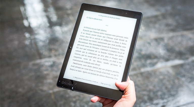
    The production of an ebook starts with an internal tension: what design decisions should we make knowing that when the ebook is on the device, the user will be able to change absolutely everything? The alignment, the line spacing, the font size, the background color. This is something that makes publishers desperate, as they often want the digital book to be as similar as possible to the paper book. An impossible task that even goes against the nature of the ebook and its potential as a product: the ability to adapt to the needs of the user. A dyslexic reader may choose a sans serif typeface and left alignment, a blind reader may choose to have the device read the book aloud.

    A well-designed ebook will be one that has clean, semantic HTML, so that the markup makes as many formatting choices as possible. In this regard, Laura Brady, of Epub Secrets, states that the three main pillars of ebook design are responsive design, interoperability and the use of fonts designed specifically for screens. 

    Says Karen McGrane: “With the rise of mobile devices, we need to abandon the fantasy that we have any control over the presentation of content. That’s history and it’s not coming back.” We can’t know what devices our book will be read on or exercise control over how it will be read. This is a hard thing for anyone coming from the print book to understand. We must relinquish control over how content is displayed and entrust the heavy lifting of design to semantic markup. Some tips for good responsive design are to understand the difference between absolute and relative units to avoid strict definitions (whenever possible) and to make use of good stylesheet practices. This is impossible to achieve with an export from InDesign: just because the book looks good on screen does not mean it is well constructed. ePUB files generated in InDesign will always need a thorough cleanup to remove “junk code”.

    Interoperability is a simple concept: it is about ensuring that the eBook works well on all devices. To do this we must avoid getting overly creative with CSS, as what looks great on one device or application could cause a disaster on another. How to achieve this? By keeping the code as simple as possible and testing the ebook on as many devices and apps as we can. 

    Finally, we must keep in mind that screen reading needs are different. Font size is just the tip of the iceberg. Print fonts are made for paper: they have areas on their various faces that are designed to accommodate ink compression or dot gain. When these typefaces are used on screens, their blocks of text can appear pale, thin and difficult to read. Details such as fine lines or serifs can hinder legibility. The way to ensure proper legibility is to use a professional font. Monotype and Creative Cloud will be our best allies. 

    While it’s not as simple as an innovative page layout or interesting typographic contrast, ebooks can be beautiful and well-designed. It has as much to do with what’s under the hood as it does with how the content is presented. An ebook that uses sound semantic markup is designed with screens in mind, works well across the spectrum of devices, and is responsive to screen size, meets all the requirements of good ebook design.

    Source: Laura Brady, “Ebook Design Is Not an Oxymoron,” in EpubSecrets, 2018. Translated and adapted by LivrizTeam.

  • The importance of accessible ebooks

    The importance of accessible ebooks

    Accessibility is to ebooks what labeling is to the food industry. When we buy a ready-made meal in a supermarket we expect to be able to know the ingredients. Will it be suitable for my friend with a nut allergy?

    Is it suitable for vegetarians? By recognizing that everyone has different needs and preferences, the industry makes it easier for people to choose the most suitable product.

    Similarly, readers have different needs and preferences, but it can be very difficult for them to know if the book they are going to buy or read meets any of their reading needs or if it is suitable for them.

    of their reading needs or whether it is able to interoperate with their assistive technologies, such as screen readers or text-to-speech. Fortunately, ebooks have the potential to meet a wide range of accessibility needs. For example, with the right format and construction, they can offer:

    • Text magnification, for people with vision difficulties. 
    • Color and contrast changes. Visually impaired people or dyslexics with scotopic sensitivity can read more easily if they can adapt text and background colors or contrasts. This also benefits people working in very dark or very bright environments. 
    • Text-to-speech support. Text-to-speech is a mature technology that allows on-screen text to be vocalized using a computer program. Good quality human-sounding voices are available in a wide range of languages. 
    • Alternative texts for images and tables. A textual description of the main points of an image or table helps convey the information to blind readers, but often assists sighted readers in their interpretation of the information. 
    • Compatibility with assistive technology devices. Screen readers perform a text-to-speech function, but also provide audio access to menus.

    Ebooks with these features are accessible to a wide range of users, from the blind to people who, for some reason, cannot physically hold a book. However, these potential benefits are not always realized. 

    It is not uncommon for barriers to accessibility to be accidentally introduced at any stage of the ebook production chain. The most common obstacles are as follows: 

    • The choice of file format influences accessibility: for example, PDF documents that are a “photograph” of the text cannot be read aloud, changed in color, or adapted to a larger font size. Flash-based “flipbooks” can be difficult or impossible to use if enlarged and resized text is needed.
    • The distribution platform interface (e.g., ebook library systems) may lack features such as font and background color change, even when the ebook format supports it. 
    • Lack of information or communication of accessibility features that exist: many products do not have accessibility guidance, despite the fact that people with access difficulties represent up to 10% of readers.

    Practice perpetuates culture and cultures perpetuate practices. The model described shows how a publisher or provider with little knowledge offers end users little information about their accessibility features. Many people with access difficulties have only a scant idea of how ebooks might meet their needs, and even library staff are not necessarily aware of the wide-ranging advantages of accessible digital text. This ignorance can lead to dangerous complacency for publishers. Patrons’ awareness can change in a single day by reading an article or attending a webinar or conference. Research conducted in 2012 showed that 10% of the 49 higher education institutions (HEIs) surveyed had accessibility as a “deciding factor” in their procurement policies. Colleges and universities can implement these policies faster than publishers’ workflows can adapt to stay in business, giving accessible publishers a significant market advantage. 

    An accessible book now means a better book. This is a tremendous shift in the mindset of publishers, as content needs to be designed with the delivery method in mind. Society itself has changed considerably in the last decade and the reliance on access to information in digital format at the point of demand, whether from a tablet or smartphone, has fundamentally altered the approach of publishers. An accessible book is not only a better book, it is a book with greater sales potential: it is a book for asbolutely all readers.

    Fuente: Woodward, H., 2014. Ebooks in education: Realising the vision. London: Ubiquity Press. DOI: https://doi.org/10.5334/bal. Translated and adapted by LivrizTeam.